Color Harmony: Balancing Bold and Neutral Tones in Home Design Feb 22, 2026
Neutral tones—such as whites, grays, and beiges—create a timeless and calming atmosphere. They serve as the perfect backdrop for any room, providing a sense of spaciousness and open air. In addition to being inherently elegant, neutral colors facilitate flexibility. This means you can easily update your decor or introduce bold accents without the hassle of repainting your entire space. Using hues like soft taupe in the living room or a warm beige in the bedroom can create a soothing environment that encourages relaxation and rejuvenation.
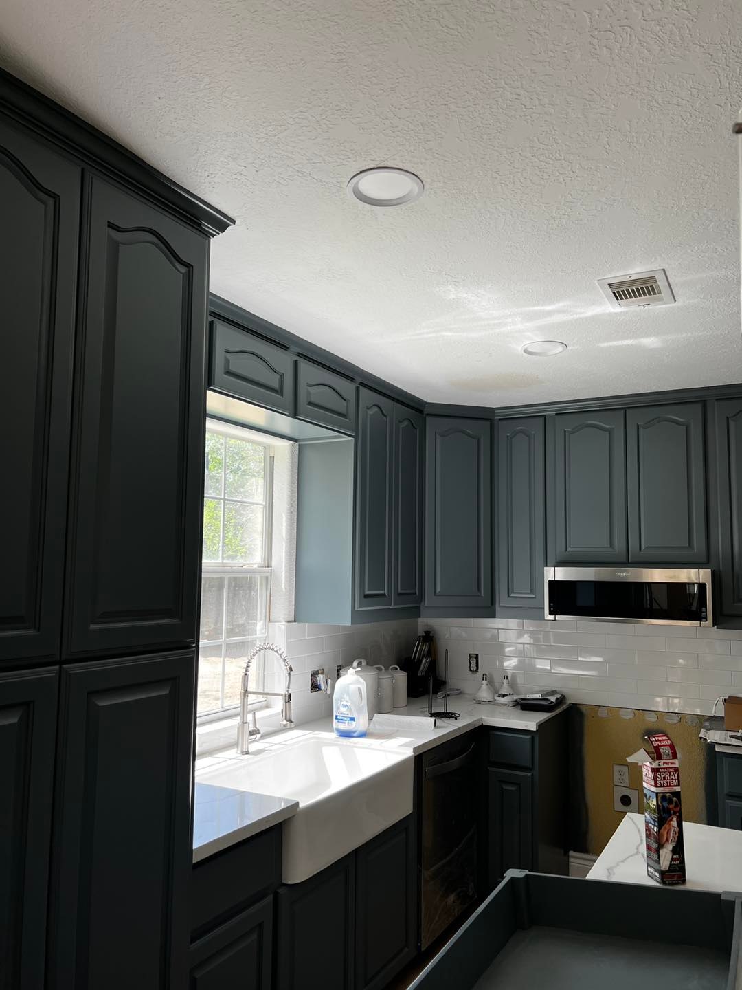
In contrast, bold colors are all about making a statement. They infuse rooms with energy and can be used to showcase unique personality traits. Rich shades—such as navy blue, emerald green, or deep red—are excellent choices for feature walls that draw the eye or serve as strong focal points in a room. These adventurous hues can make smaller spaces feel vibrant and modern. However, integrating bold colors calls for careful consideration to prevent overwhelming your design.
Finding the perfect balance between these color extremes starts with understanding the impact of color psychology. Neutrals often add warmth and tranquility, conducive to unwinding after a long day. Meanwhile, bolder colors can energize and inspire, encouraging creativity and engagement. When you begin selecting colors for your home, consider how each room is used and the mood you wish to create within them.
To successfully blend bold and neutral colors, consider adopting the 60-30-10 rule, a foolproof method popular in interior design. Start with a neutral tone as the main color, occupying 60% of the space. This creates a cohesive look, allowing the room to feel grounded. Add a secondary color, typically another neutral, to occupy 30% of the design. This might include furniture or floor coverings. Finally, use bold accent colors to make up the remaining 10%—a splash of cheerful yellow through artwork, or vibrant pillows and throws in a fiery orange can make a lasting impact, bringing character and interest.
Remember, lighting is your silent partner in home design and can amplify your chosen palette’s effect. Natural light works wonders with neutral shades, highlighting their subtle complexities. By contrast, bold colors can look dramatically different under artificial lighting, underscoring the importance of testing sample swatches at different times of the day before committing to a particular hue.
In conclusion, achieving color harmony requires insight into how colors interact. It’s about maintaining a synergy where neutrals provide the foundation, allowing bold shades to shine without overpowering the senses. As you embark on your home design journey, leverage the expertise at AGD Painting to create a balanced space that resonates with your unique preferences. With the right combination of bold and neutral colors, the world of design possibilities is truly limitless, ensuring your home remains both elegant and inviting.
/filters:no_upscale()/filters:format(webp)/media/3de78f5d-3f68-4f4e-8523-03e3b26a9694.jpg)
/filters:no_upscale()/filters:format(webp)/media/fbd5a417-7599-4e80-9ab5-a39953e7dbf7.jpg)